Letztes Jahr in Fragen 2021
New visual identity
For this year's edition of LJiF, I took it upon myself to reinvision the appearance of the event. I started with some hand drawn lettering.
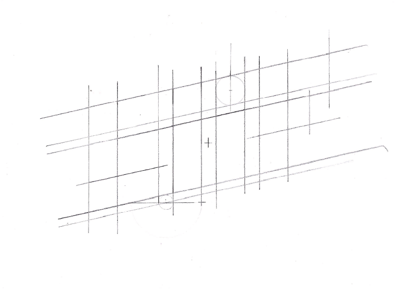
Later, I digitized those drawings to create a modern looking wordmark.
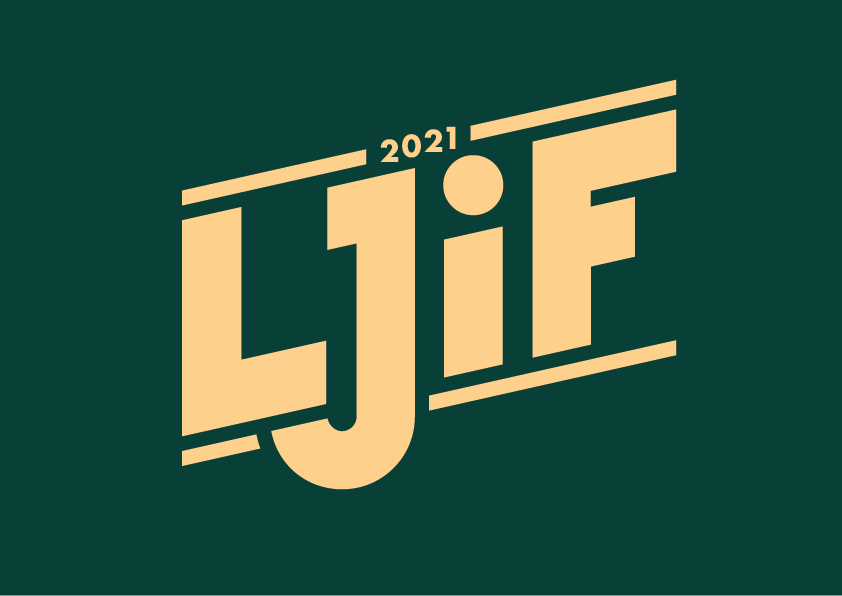
After some discussing with my friend and Co-Host of the quiz, we both figured that the logo was looking a bit too bland and serious. After some back and forth, we thought it might look cool in a neon sign style.
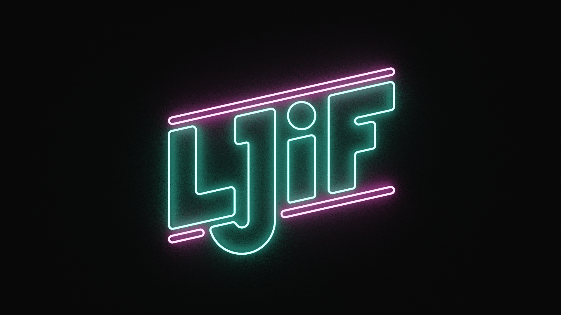
This first version is a rendering I created in blender. You might think rendering the logo in a 3d software is an overkill, but I knew that I wanted to have the flexibility to create a whole world surrounding the logo, which I eventually did.
Videos
As has become a tradition, we announced the event with a series of trailers which we sent out to our newsletter subscribers and published on our instagram accounts. As we already had a Retro-Futuristic look going on, we wanted to further venture into that and came up with two trailers. We recreated a VHS look and edited the video in a 4:3 aspect ratio.
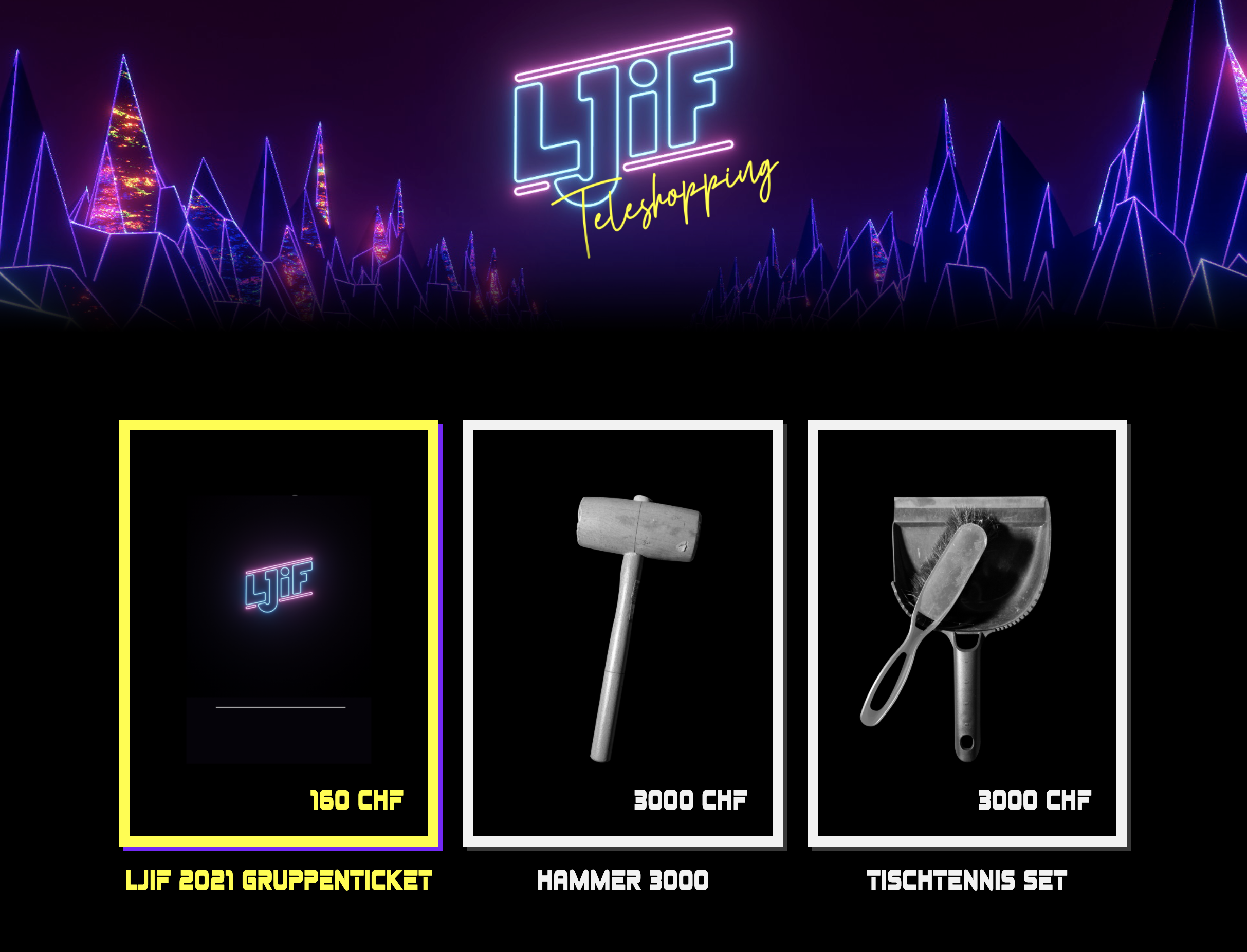
The first trailer was us selling tickets for our event in a teleshopping setting.
The second trailer is a short story set in a synthwave-neon-future:
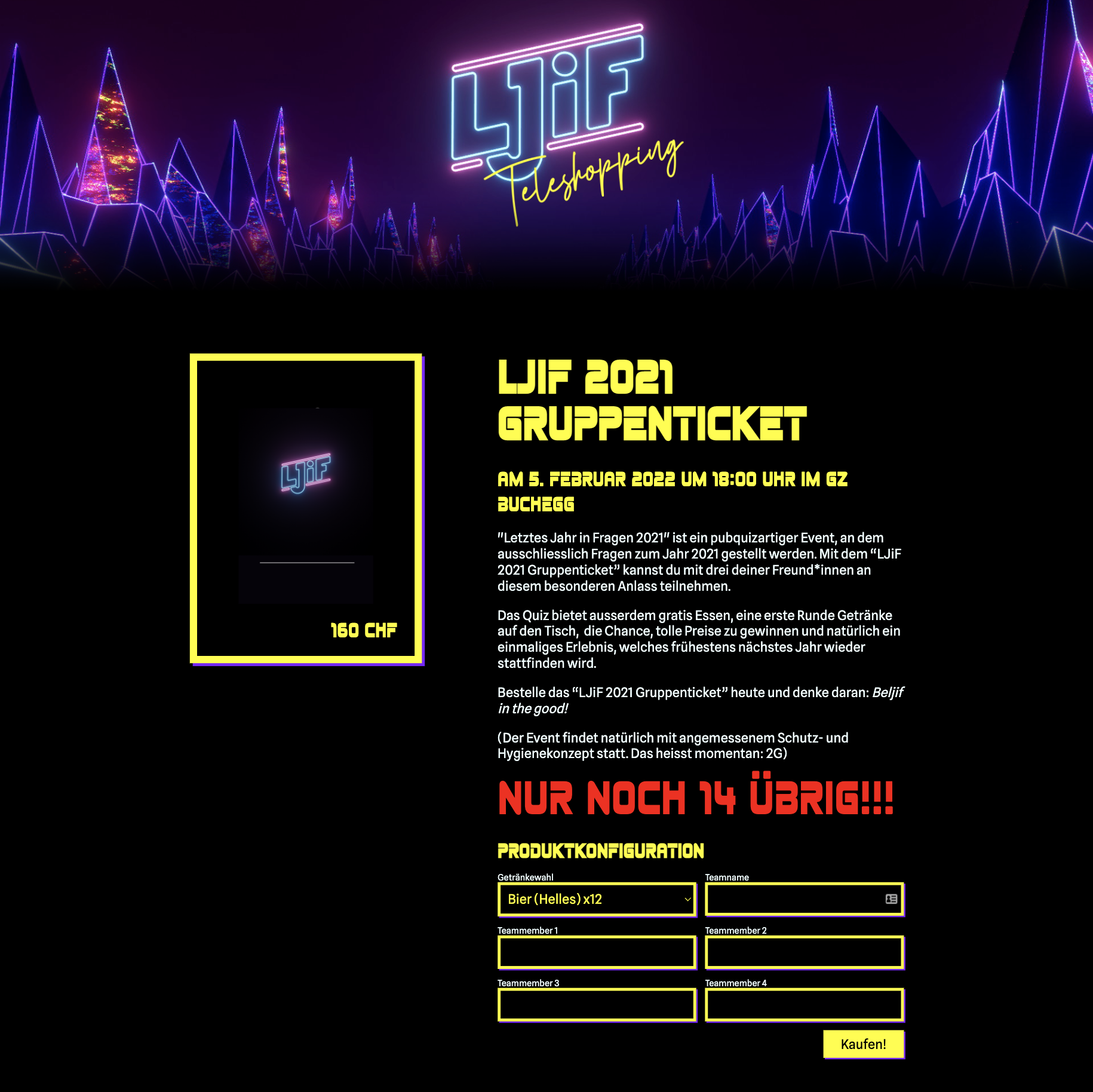
Webshop
As this was our first time selling tickets for our events, I designed and programmed a simple webshop. Because we only sold one product, I added two "fake" products, that we had also pretended to sell in our first trailer.
I wanted to keep the user flow as straightforward as possible and seeing that we only had one product I decided to skip the step where a user has to add a product to their cart and then proceed to the checkout. Instead, the user was able to directly checkout from the product detail page.
The shop was a really simple vue app in the frontend, which connected to a commerce.js instance. Payments were handled with stripe.